Thank you for buying i-spirit! We have developed it with great care and love. Our main aim was to give excellent browsing experience to your visitores as well as provide easy to use admin controls to you. We have tried to add all the possible features one would want from their web site. We've done our very best to keep the theme suitable for each and every kind of device, 3 inch mobile phone screen to large high resolution screens. With few clicks you can create beautiful, classic or flat, clean and modern website. With i-Spirit design possibilities are endless.
i-spirit Theme Documentation
Designed & Developed by TemplatesNext © 2014
To use i-spirit, you will have to have wordpress pre-installed, preferably version 3.6 or above. if you need help in installing wordpress please visit http://codex.wordpress.org/Installing_WordPress for detailed instructions.
If you are using the plugin "TemplatesNext Toolkit" with existing WordPress,
Please Deactivate/Uninstall before installing i-spirit, as i-spirit comes with much advanced plugin named "Templatesnext Shortcode" with 65+ shortcodes,
portfolio post type, Team post type, client post type, testimonial post type and gallery post types.
Uploading i-spirit
The theme files need to be uploaded before you can activate the theme for use. There are two ways you can do this, FTP upload or WordPress upload.
- If you are uploading via FTP upload, then you need to upload the unzipped folder "i-spirit" to the /wp-content/themes folder of your WordPress installation.
- If you are uploading via WordPress upload, then navigate within the WordPress admin area to Appearance > Add New Themes > Upload. Select the zipped file "ispirit.zip" (packed within file ispirit-pack-x.x.x.zip) and then press Install Now.
In case of any error please re-check and confirm you are uploading the ispirit-pack-x.x.x/ispirit.zip in the wordpress theme folder. You may have to unzip the file that you download from TemplatesNext to find this.
Activating i-spirit
To active, please go to Appearance > Themes, locate i-spirit and press the activate button.
Install Plugins
Once you activate i-spirit, you will find a notice on top of the dashboard screen about the plugins that we recommend you install for use with i-spirit. Click 'Begin installing plugins' and install/activate the plugins one by one. You can also access this page by going to Appearance > Install Plugins.
If you are using i-spirit with existing WordPress, we recommend using
Regenerate Thumbnails
plugin and regenerate the existing thumbnails.
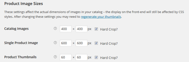
WooCommerce Image Settings
If you are using WooCommerce, we recommend you to change the image settings like the following screenshot by going to WooCommerce > Settings > Products and scroll down until you find the "Product Image Sizes" section
NOTE: Before importing demo content please ensure you have plugin "Contact Form 7" installed and active, also have WooCommerce
Installed and active if you are going to use WooCommerce
Both the theme content and theme options have been provided so that you can set up the theme to look exactly like the demo in a few minutes.
Full Demo Import
We've provided the FULL demo content import file, that will allow you to replicate the demo site that we show. This file is titled "i-spirit-demo-content.xml" and can be found within the "Demo Content" folder.
Alt Demo Import
If the Full demo import fails for you, it will likely be due to your server memory settings, which will be limiting the import. In this case, we have provided an XML file without the media included, which will should import fine 100%. You can find this file within the "/Demo Content" folder, named "i-spirit-demo-conten-alt.xml".
Theme Options Import
The theme options text file is to copy and paste the contents into the box provided within Theme Options, under the "i-spirit Settings Import/Export" sub-menu. You can find this file, named "i-spirit-theme-options.txt" within the "Demo Content" folder.
Increase WordPress/PHP Memory Limit
If you have any issues with the import, i.e. any errors, then you'll likely need to increase the memory limit and try again. Here's a guide of how to proceed if you come across issues:
- Edit wp-config.php and enter the following at the bottom of the file:
define('WP_MEMORY_LIMIT', '64M'); - If you have access to your server's PHP.ini file, then find the following line and increase the value, for example:
memory_limit = 64M - If you don't have access to your server's PHP.ini file, then try adding this to the bottom of the
.htaccess file at the root of your WordPress site:
php_value memory_limit 64M - If you aren't confident enough to attempt the above yourself, or nothing has worked, then please contact your host directly - they will be able to help.
Theme Settings
i-spirit uses one of the most advanced option framework called "Redux framework" and we tried to use all the features of "Redux" to our users adavantage at maximum keeping the controls easy and simple. We encourage you to use the controls freely and find the best settings that suits your requirements.
To start setting up i-spirit, go to i-spirit option > General Settings
Every time you make any change, you must save the changes.
Enable Maintenance Mode
Turn it on/off to enable or disable maintenance mode. Logged in admin will not see the maintenance mode.
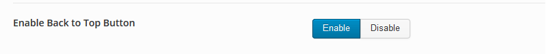
Enable Back to Top Button
Enable or disable the go to top arrow button that appears right end bottom corner on the pages.
Default Layout
This will switch between boxed and wide layout along with hide/reaveal sub options for boxed type layout.
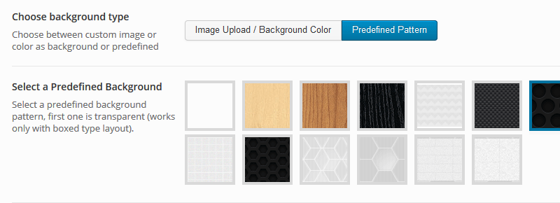
Choose background type
A sub option of boxed layout. which further have sub options of "Image Upload / Background Color" and "Predefined Pattern".
Body Background
Lets you select between background image along with all the background property and solid background color. if you choose background image then set the background color transparent.
Select a Predefined Background
This option is visible when "Choose background type" option is set to "Predefined Pattern". it lets you select a predefined pattern as background image.
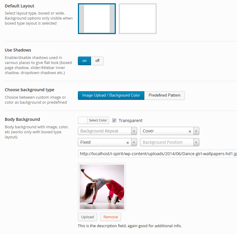
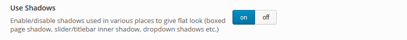
Use Shadows
This option Enable/disable shadows used in various places (boxed page shadow, slider/titlebar inner shadow, dropdown shadows etc.).
To have a flat layout turn the shadows off.
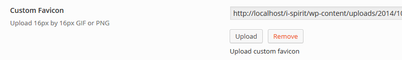
Custom Favicon
Upload and use your custom favicon, recommended size and formats are 6px by 16px GIF or PNG.
Custom IOS Icons
Upload custom IOS icons for different IOS devices.
This section contains the basic color/fonts setting of i-spirit
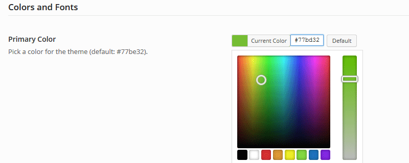
Primary Color
Select the primary color of your website here
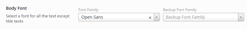
Body Font
Select the main font for your website from google fonts, it applies on all the text except on the titles.
You can select a "back up font family" for a situation where google fonts are not available
Body Font Size
Select font size for the body text, some of the decorated text like meta details will not change. for that custom
CSS can be helpful.

Body Text Line Height
Set the line height for body text, in simple term it controls the spacing between lines of text.

Top navigation menu Font Size
Set the font size for top navigation bar.

Title Font
Select Font for most of the title

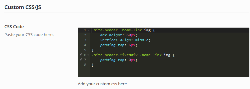
This section is to add custom CSS and JS giving you limitless flexibility
CSS Code
Write your custom CSS code to further customize i-spirit
JS Code
Write your custom JS without the <script> tag , including tracking code.
This section contains header customization settings
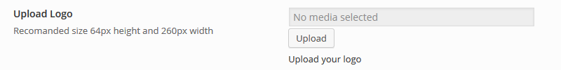
Upload Logo
Upload your logo here, recommended size is 64px in height and 260px in width.
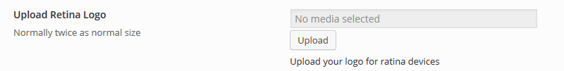
Upload Retina Logo
Upload logo for retina devices, normally twice the size of normal logo, that is 128px by 520px.
Enable Login/Logout
Enable/Disable Login/logout link on top navigation bar.

Enable Shopping Cart
If you are using WooCommerece, you can enable the shopping cart icon link on main navigation bar

Enable Search
Enable the search icon link that expands to search input on top nav bar

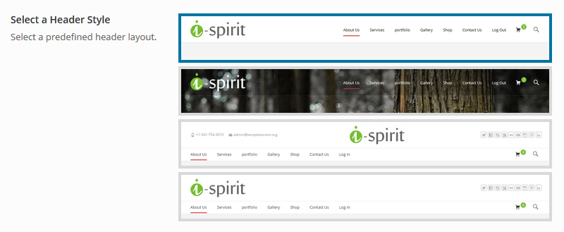
Select a Header Style
We have included 4 predefined headers which further can be combined with "Top bar", "Woocom Bar" and "max mega menu" to give you multiple options. Every header option have their customization settings that appears/disappears depending on your selection.
On selecting the third and fourth options you will find the settings for -
- Phone and email
- Social Links
- Custom Text, which supports short codes (ex. to publish a menu just enter [nx_menu name="Menu Name"]), font awesome(ex. for pie chart icon <i class="fa fa-pie-chart"></i>)
Sticky Header
Enable / disable sticky header.

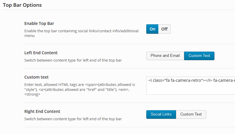
Top Bar Options
Enable / disable top bar along with its contents. switch on the desired content and fill in the inputs.
This section contains settings for all the liting page settings including archives/category listing
Show/Hide Title Bar
Show/Hide Title bar

Title Text Color
Set title text color.

Title text alignment
Set title text alignment.

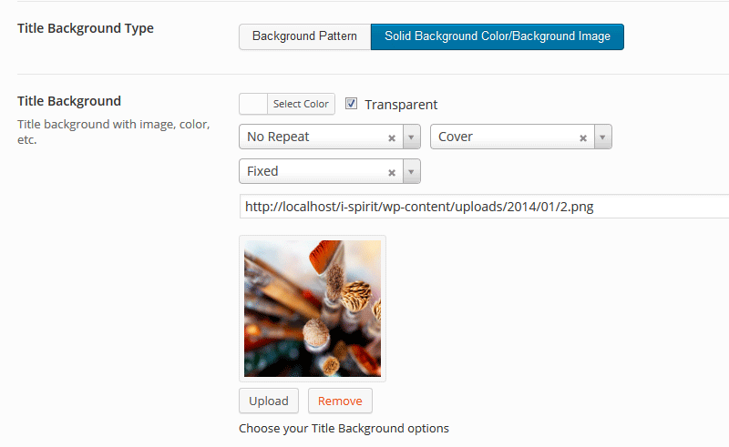
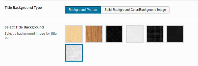
Title Background Type
Set title background type, this will further show hide sub option of "solidbackground color/background image" and "Background pattern"
select option .
and
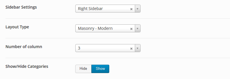
Sidebar Settings
Select side bar position for archive/category pages, let, right or none
Layout Type
Select Layout type
Number of column
Select Number of column for masonry multi column archive/category pages
Show/Hide Categories
Show/hide category lists in posts
We have added maximum flexibility in WooCommerce section so that the visitors enjoy browsing and shopping in i-spirit
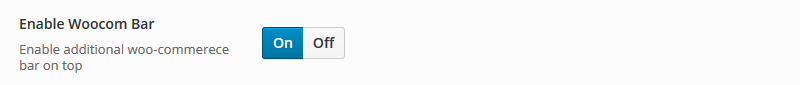
Enable Woocom Bar
This is an unique feature in i-spirit so that the visitors find most of the shopping related links at one place,
Enable Disable the Woocom bar, once enabled the "Enable Compare Products Link" setting appears.
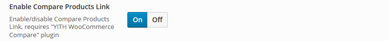
Enable Compare Products Link
If you have "YITH Woocommerce Compare" installed and active this link on Woocom bar will open the popup with products in compare list
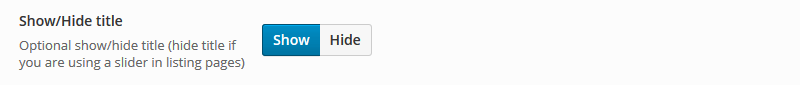
Show/Hide title
Show/Hide Title bar on WooCommerece Listing pages
Show/Hide Breadcrumb
Show/Hide Breadcrumb on WooCommerece Listing pages

Following options like Header Text Color, Title text alignment, Title Background Type same as "Archive/Category Options" settings
Sidebar Settings
Set Side bar options for Woocommerce Listing Pages, Different set of side bars have been provided for Woocommerce.

LayerSlider ID
Enter the LayerSlider ID for the slider that you want to show (shop front page).
Revolution slider alias
Enter the revolution slider alias for the slider that you want to show (shop front page).
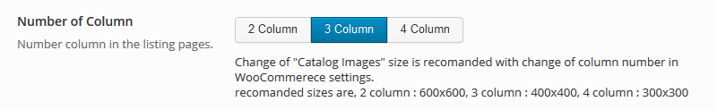
Number of Column
Select Number of products to be shown per row in product listing pages.
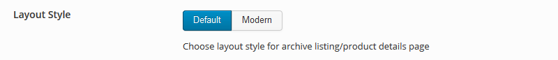
Layout Style
Choose a layout style for listing pages, this will effect the product details pages as well
Product Image Zoom On Hover
Enable/Disable Product zoom on hover on product details pages.

This section contains footer customization settings
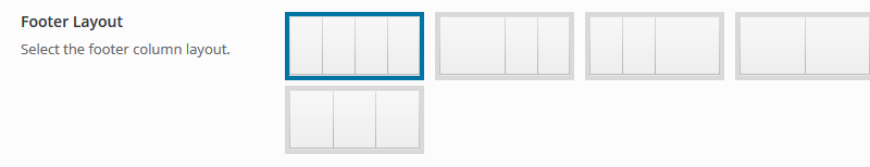
Footer Layout
Select footer column layout
Footer Bottom Right
Select options for footer bottom right, options available are "footer menu"(menu location name "Footer Menu"), "Social Link Icons" and "Blank"
Footer Copyright text
Enter Copyright text here
Add Social URLs, usernames/handles here
Import/Export i-spirit settings
Page, Post And Other Custom Post Type Settings
i-spirit comes with "Slider Revolution" from Theme Punch. There are multiple demos included in the package, you can import any one of the demo and start using or create one from scratch.
To place a slider as page banner, copy and paste Revolution Slider "Slider Alias" and paste it in page meta field "Revolution slider alias"
NOTE: If you have the "t-next Slider" or "LayerSlider" enabled, then this will be ignored.
Slider Settings
All the page setting options are placed bellow the editor
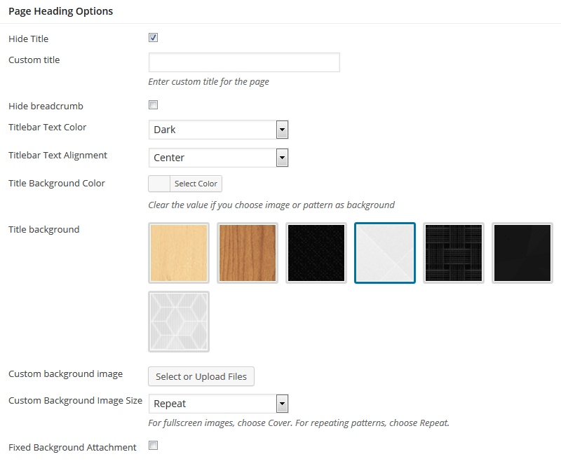
Page Heading Options
Hide Title
Hide the title bar incase you want to use a slider instead of the page title bar or keep it empty
Custom title
Replace default title with custom title
Hide breadcrumb
Hide the breadcrumb from that page/post/portfolio/product page
Titlebar Text Color
Change the title text color based the title bar background image/color
Titlebar Text Alignment
Align Titlebar text centered or default left.
Title Background Color
Change the background color of the title bar, keep it blank clicking "clear" button incase you are using a pattern on background image.
Title background
Select any predefined pattrn as background for the title bar.
Custom background image
Upload or select a background image for the title bar, keep it empty if you are using color or pattern as background
Custom Background Image Size
Select background image property.
Fixed Background Attachment
Check the input to have a fixed positioned background image.
Slider Options
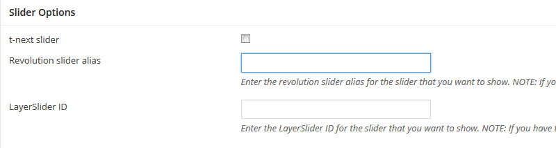
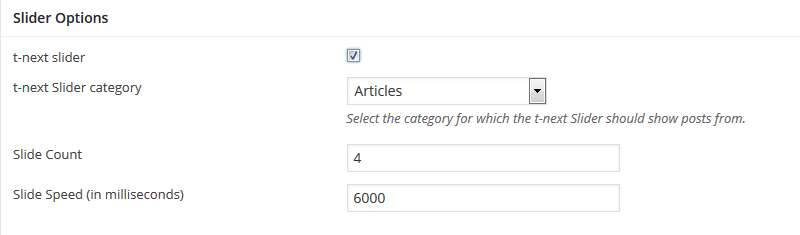
t-next slider
Turn "t-next slider" ON for using posts from a particular category as slides, only thumb images and title(anchored to the post) will be used in slider.
Revolution slider alias
Enter the revolution slider alias for the slider that you want to show. NOTE: If you have the "t-next Slider" or "LayerSlider" enabled, then this will be ignored.
LayerSlider ID
Enter the LayerSlider ID for the slider that you want to show. NOTE: If you have the t-next Slider enabled above, then this will be ignored.
Slider Settings
t-next slider settings
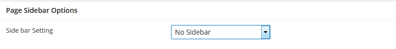
Sidebar Options
Turn on the side bar on left or right, using additional plugin like "Simple Page Sidebars" will let you use different sidebar for different pages.
"page Heading Options", "Slider Options" and "Sidebar Option" remains same as Page Settings
Thumbnail images are not replacement for featured image, featured image is required for widgets and plugins.
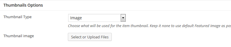
Tumbnail Options
Thumbnail Type Image
Select/upload a image to be used as thumbnails in listing pages for the the post.
Thumbnail Type Video
Enter Youtube.com or vimeo.com video url to be used as thumbnail.
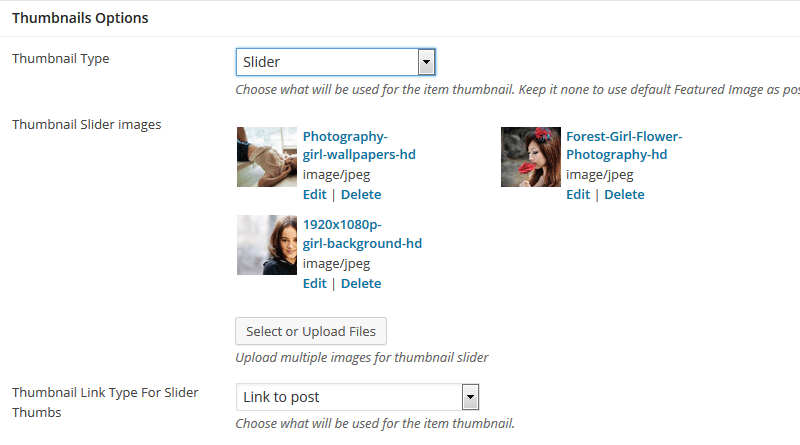
Thumbnail Type Slider
Select/upload images for silder to be used as thumbnail.
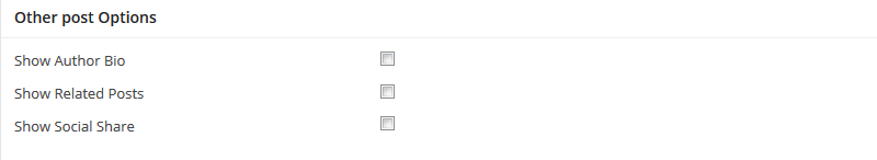
Other Post Options
Show Author Bio - Check to show authors bio.
Show Related Posts - check to display the related posts.
Show Social Share - display the social share links.
"page Heading Options", "Slider Options" remains same as Page Settings and "Thumbnaul Options" remains same as Post Settings
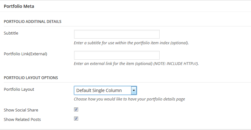
Portfolio Meta
Portfolio Additional Details
Subtitle
Enter a sub title or additional tittle for the portfolio page.
Portfolio Link(External)
External URL to the portfolio item
Portfolio Layout Options
Portfolio Layout
Choose between default single column layout and two column side by side layout.
Show Social Share
Show/hide social share icons
Show Related Posts
Show/hide Related portfolio items
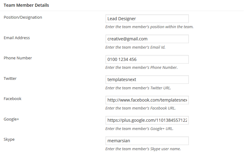
Settings for team member pages and details of the team member.
"page Heading Options" remains same as Page Settings. "Featured Image" appears as team members photo
Position/Designation
Team members position or designation
Email Address
Team members email id
Phone Number
team members phone number
Team members Twitter handle
Facebook URL
Google+
Google+ URL
Skype
Skype username.
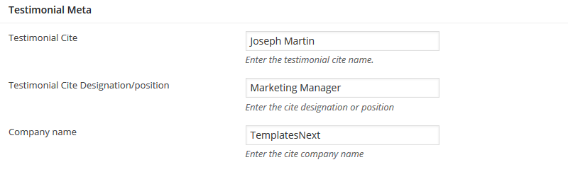
Testimonial settings.
Testimonial Cite
Name of the testimonial giver
Testimonial Cite
Name of the testimonial giver.
Testimonial Cite Designation/position
Designation or position of testimonial giver.
Company name
Organization name
Shortcodes are used to display the testimonials.
Clients post type settings
Upload Clients logo using "Featured Image", Add the clients URL
Shortcodes are used to display the clients logo carousel.
"page Heading Options", "Slider Options" and "Sidebar Options" remains same as Page Settings.
Product Meta
Enable/Disable social share checking the "Show Social Share"
Short Codes
"Templatesnext Shortcode" system is one of the most advanced and easy to use shortcode generator available today. Currently we have more then 60 shortcode and we will keep adding more as i-spirit users demand. This document will cover most commonly used shortcodes only
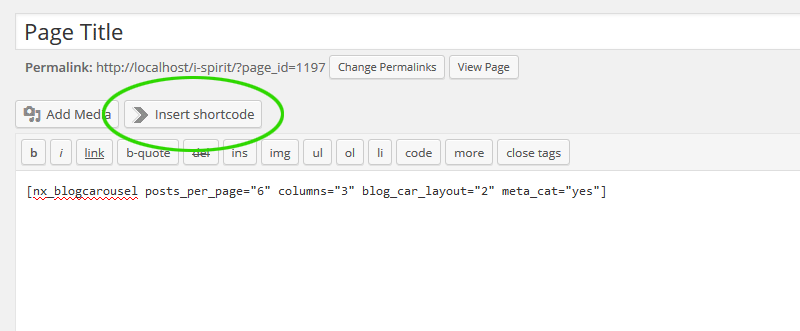
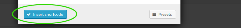
To insert shortcode, place the cursor in page/post/portfolio/product edit screen editor, where you want the element to appear and press the button "Insert Shortcode". this will open the shortcode generator popup. Select the shortcode from the generator list and it will take you the shortcode option page. Press the "Insert Shortcode" after options are set. Every shortcode has their default settings/values.
You can always manually edit the shortcode parameters/options.
Size
Font size in pixel.
Align
header text alignment
Margin
Bottom margin
Class
Additional class assignment
Content
Heading Text
Style
Currently we have only one default style, we will add more style in future versions.
Active Tab
The position of the active tab
Vertical
Vertical or horizontal tabs
Class
Additional class assignment
Content
Tab shortcodes with contents
"Tab" are used within "Tabs" shortcode.
Title
Title of a single tab
Disabled
whether the tab enabled or disabled
Vertical
Vertical or horizontal tabs
Class
Additional class assignment
Content
Tab shortcodes with contents
You can wrap multiple spoilers with [accordion] shortcode to create accordion effect?
Title
Title of an Spoiler
Open
whether the spoiler open or closed
Style
Select Style Between default, fancy and simple
Icon
Select an icon for the spoler title
Anchor
Use an anchor to access the spoiler
Class
Additional class assignment
Content
Content of the spoiler
Multiple spoilers are wrapped around with [accordion] shortcode to create accordion effect?
Class
Additional class assignment
Content
Spoilers and contents
Show TOP Link
Enabling "Go To Top" link with the divider
Link Text
Text to be hyperlinked
Class
Additional class assignment
Height
Height of the spacer in pixel.
Class
Additional class assignment.
Style
Currently we have one default style
Cite
Name of the author
Cite URL
URL of the auther if any.
Class
Additional class assignment
Content
The quote
Style
Select between default, light, flat and simple
Size
Size of the dropcap
Class
Additional class assignment
Content
The dropcap letter
Rows are most commonly used shortcode along with column.
Class
Additional class assignment
Content
The row content, can be normal content or combination of other shortcodes within columns in a row.
Columns are wrapped around with [row] shortcode
Size
Select a column size
Centered
Column with centered content or not.
Class
Additional class assignment
Content
The column content, may contain combination of other shortcode
Icon
Select an icon or upload an images to be used as bullet
Icon Color
Select icon color
Class
Additional class assignment
Content
The list content
Link
Button Link
Target
Button link to be opened in same window or different window
Style
Select a button style
Background
Select a background color
Text Color
Select button text color
Size
Size of the button
Fluid
Fluid button will have 100% with, select yes or no.
Centered
Button alignment in the page
Radius
Button corner radius
Icon
Select an icon or upload an images to be used as bullet
Icon Color
Select icon color
Text Shadow
Select text shadow property
Description
Small description under button text. This option is incompatible with icon.
onClick
Advanced JavaScript code for onClick action
Class
Additional class assignment
Content
Button text
Title
Service Title
Icon
Select an icon or upload an images.
Icon Color
Select icon color
Icon Size
Select a size for the icon
Class
Additional class assignment
Content
Service description
Title
Icon Box Title
Icon
Select an icon or upload an images.
Icon Size
Select a size for the icon
Class
Additional class assignment
Content
Icon box content
Full Width
Forced full width, will not work with sidebars on the page.
Overlay
Select a overlay color.
Overlay Opacity
Choose a overlay opacity
Poster URL
Enter a image URL to be used as poster
MP4 URL
Url of the MP4 video file
WEBM URL
Url of the WEBM video file
OGG URL
Url of the OGG video file
Class
Additional class assignment
Content
Video parallax content
Full Width
Forced full width, will not work with sidebars on the page.
Overlay Color
Select a overlay color.
Overlay Opacity
Choose a overlay opacity
Poster URL
Enter a image URL to be used as poster
Poster Image Upload
Select/Upload a background parrallax image, will override "Poster Url"
Parallax Image Repeat
Select parallax image property
Parallax Movement
Select between dynamic and fixed
Class
Additional class assignment
Content
Image parallax content
Full Width
Forced full width, will not work with sidebars on the page.
background Color
Select a background color.
Text Color
Select dark if you have light background or vice versa.
Button Text
Call to act button text
Button URL
Button link
Class
Additional class assignment
Content
Call to act text, you can use "Fancy Blocks" shortcode if you need futher flexibility
Title
Title of the boxed content
Style
Select a box style.
Color
Select color for the box title background and borders.
Title text color
Select title text color
Radius
Radius of the box corners
Class
Additional class assignment
Content
box content, other shortcodes can be added as content.
Pie Chart Title
Title of the pie chart
Piechart percent
Percent value of the chart
Bar Color
Select color for the pie chart bar.
Track Color
Select a track color, a semi-transparent value will be used as track color.
Line Width
Thickness of the bar
Pie Size
Diameter of the pie chart
Class
Additional class assignment
Content
Piechart Details text.
Url
Enter the youtube video URL, ex. https://www.youtube.com/watch?v=1k59gXTWf-A
Width
Width of the video, keep it default if you are using responsive option on.
Height
Height of the video, keep it default if you are using responsive option on.
Responsive
Turn it on if you want the video to be responsive
Autoplay
Turn on autoplay.
Class
Additional class assignment
Url
Enter the vimeo video URL, ex. https://vimeo.com/90096198
Width
Width of the video, keep it default if you are using responsive option on.
Height
Height of the video, keep it default if you are using responsive option on.
Responsive
Turn it on if you want the video to be responsive
Autoplay
Turn on autoplay.
Class
Additional class assignment
File
Select/upload a MP4 file
Poster
Select/upload a post for the video.
Title
title for the video.
Width
Width of the video
Height
Height of the video.
Controls
Show/hide playback controls.
Autoplay
Turn on/off autoplay
Loop
Play video in loop.
Class
Additional class assignment
Menu Name
Enter the menu name, find/create the menu name in "Appearance > Menus"
Class
Additional class assignment
Width
Width of the map
Height
Height of the map.
Full Width
Forced full width, will not work with sidebars on the page.
Responsive
Turn it on if you want the map to be responsive
Marker
Address to be pointed on the map
Class
Additional class assignment
Source
Choose images source. You can use images from Media library or retrieve it from posts (thumbnails) posted under specified blog category. You can also pick any custom taxonomy
Limit
Maximum number of image source posts (for recent posts, category and custom taxonomy).
Link
Select which links will be used for images in this gallery.
Links target
Target window for the link
Width
Slider width (in pixels), responsive slider will ignore width
Height
Slider height (in pixels).
Responsive
Ignore width and height parameters and make slider responsive
Show titles
Display slide titles.
Center
Alignment of the slider on the page
Arrows
Show/hide left, right navigation arrows
Pagination
Show/hide pagination controls
Mouse wheel control
Allow to change slides with mouse wheel
Autoplay
Choose interval between slide animations. Set to 0 to disable autoplay.
Speed
Specify animation speed
Class
Additional class assignment
Source
Choose images source. You can use images from Media library or retrieve it from posts (thumbnails) posted under specified blog category. You can also pick any custom taxonomy
Limit
Maximum number of image source posts (for recent posts, category and custom taxonomy).
Link
Select which links will be used for images in this gallery.
Links target
Target window for the link
Width
Carousel width (in pixels), responsive slider will ignore width
Height
Carousel height (in pixels).
Responsive
Ignore width and height parameters and make carousel responsive
Item To Show
How many carousel items is visible
Scroll number
How many items are scrolled in one transition
Show titles
Display titles for each item
Center
Alignment of the carousel on the page
Arrows
Show/hide left, right navigation arrows
Pagination
Show/hide pagination controls
Mouse wheel control
Allow to change carousel with mouse wheel
Autoplay
Choose interval between animations. Set to 0 to disable autoplay.
Speed
Specify animation speed
Class
Additional class assignment
Animation
Select an animation type for the content
Duration
Animation duration (seconds)
Delay
Delay after the element appears on the screen, if you have multiple item in the same row, delay is helpful in animating one after another.
Inline
This parameter determines what HTML tag will be used for animation wrapper. Turn this option to YES and animated element will be wrapped in SPAN instead of DIV. Useful for inline animations, like buttons
Class
Additional class assignment
Content
Animated content, you can use other shortcodes as content, like images, box, icon box, video, etc.
Post ID's
Enter comma separated ID's of the posts that you want to show, keep it blank for all posts.
Posts per page
Specify number of posts that you want to show per page.
Category
Select terms to show posts from, select none/all (use ctrl+click to select/deselect) for all. selecting none or all both will show posts from all categories
Layout Type
Select blog layout type
Number of columns
Select number of column, masonry works with 2-4 columns layout.
Order
Posts order, descending or acending.
Order by
Select order by
Show Categories
Show/hide categories along with posts
Paging
Show/hide pagination
Ignore sticky
Ignore sticky to show posts in correct order or the stickies will be listed first.
Pagination & filter alignment
Alignment of the pagination
Post ID's
Enter comma separated ID's of the posts that you want to show, keep it blank for all posts.
Number of posts
Specify number of posts that you want to show in the carousel.
Category
Select terms to show posts from, select none/all (use ctrl+click to select/deselect) for all. selecting none or all both will show posts from all categories
Number of columns
Number of columns visible in carousel
Order
Posts order, descending or acending.
Order by
Select order by
Blog Carousel Layout
Select blog carousel layout type
Show Categories
Show/hide categories along with posts
Ignore sticky
Ignore sticky to show posts in correct order or the stickies will be listed first.
Post ID's
Enter comma separated ID's of the portfolios that you want to show, keep it blank for all posts.
Posts per page
Specify number of portfolio items that you want to show per page.
Category
Select terms to show portfolio items from, select none/all (use ctrl+click to select/deselect) for all. selecting none or all both will show portfolio items from all categories
Portfolio Layout
Select portfolio layout type
Number of columns
Select number of column, masonry works with 2-4 columns layout.
Order
Posts order, descending or acending.
Order by
Select order by
Category Filter
Use category Filter (only available with masonry layout)
Paging
Show/hide pagination
Pagination & filter alignment
Alignment of the pagination
Post ID's
Enter comma separated ID's of the team that you want to show, keep it blank for all posts.
Posts per page
Specify number of team items that you want to show per page.
Number of columns
Select number of column.
Paging
Show/hide pagination
Client ID's
Enter comma separated ID's of the client that you want to show, keep it blank for all clients.
Number of Clients
Specify number of clients to be shown in the carusel
Fancy Blocks are higly configurable blocks, can be used as row with background color/image,
advertising blocks or "call to act" row. use other shortcode with it to
create desired bloks. You can use "spacer" shortcode for top and bottom padding.
Use "fullwidthrow" in class to have a full with row.
Height
Height of the block, leave it blank for auto height
Background Color
Select a background color
Background Image
Select/upload a background image
Background Repeat/Cover/No Repeat
Select a background property/behaviour.
Background Position
Select a background position
Select Arrow Position
Select decorative arrow position
Class
Additional class assignment
Content
Fancy Block content, you can use other shortcodes as content, like images, box, icon box, video, etc.
Menus, WooCommerce Category, Widgets Settings etc.
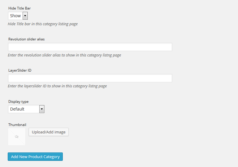
i-spirit has many unique features, one of them is WooCommerec category page slider option, In "Add New Product Category" form
and "Edit Product Category" screen i-spirit has "Revolution slider alias" and "LayerSlider ID" input option for specific slider
for specific category page.
There are two menu locations in i-spirit "Navigation Menu" and "Footer Menu" but with shortcode [nx_menu name="Socio bar Menu"] i-spirit can disply menus from "Custom text" options on header and anywhere on the page.
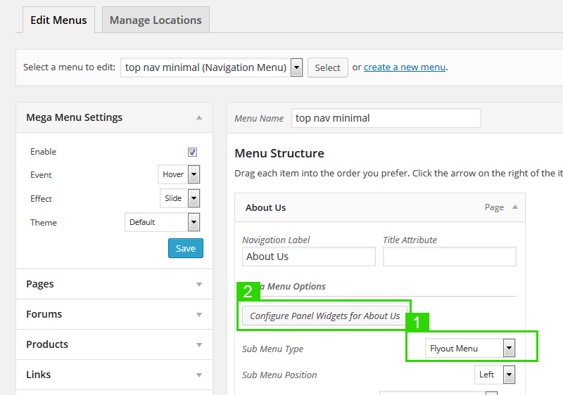
Max Mega Menu
To customize the mega menu go to "Appearance > Menu Theme" and set options.
To activate "Max Mega Menu", select the menu that already been asigned to a location, check the "Enable" check box in mega menu setting panel.
To add a mega menu panel
- Slect "Mega Menu panel" in Sub Menu Type.
- Click on "Configure Panel Widgets for menu name" button, it will open the mega menu widget select popup. for more details on mega menu visit www.maxmegamenu.com or watch youtube video
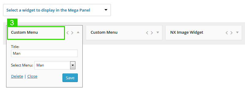
- Select "Custom Menu" widget to insert sub menus as columns ( you will have to create the sub menus separately in Appearance > Menu )
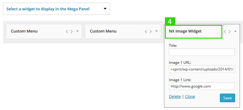
- Select "NX Image Widget" widget with image URL and link to insert image and save
i-spirit comes with 7 custom widgets to power up your website
- NX Advert Grid Widget
- NX Image Widget
- NX Portfolio Grid
- NX Portfolio List
- NX Recent Comments
- NX Recent Posts
- NX Tweets
NX Advert Grid Widget
Add up to 8 images along with links
NX Image Widget
Single image with link widget, useful for mega menu widget panel.
NX Portfolio Grid
Portfolio widget in grid format, only images in grids along with tooltip on hover.
NX Portfolio List
Portfolio widget in list format, displays images with portfolio item name.
NX Recent Comments
Recent comments with autor avatar.
NX Recent Posts
Displays recent posts with posts thumbs, title, autor and post date.
NX Tweets
Displays latest tweets of an user.
This widget requires "Twitter Feed Auth" plugin installed and active. To set up please visit
plugin page.
With i-spirit possibilities are endless, there are few pre defined CSS class/selectors for you to use.
fullwidthrow
It forces the row or block to 100% in sidebar-less wide layout page.
no-page-pad
Removes the top and bottom page padding. used as page class inserted in page/post meta > Miscellaneous Meta > Additional Page Class
gallery-alt
Gives alternate varient of portfolio gallery style
clearfix
Clears all floating divs.
mt0
Margin top 0px.
mb0
Margin bottom 0px.
mr0
Margin right 0px.
ml0
Margin left 0px.
pt0
Set padding top 0px.
pb0
Set padding bottom 0px.
pr0
Set padding right 0px.
pl0
Set padding left 0px.
darktext
Set text color to hex value #373737.
lighttext
Set text color to hex value #E7E7E7.
whitetext
Set text color to hex value #FFFFFF (white).
blacktext
Set text color to hex value #000000 (black).
nx-al
Text aligtn left.
nx-ar
Text align right.